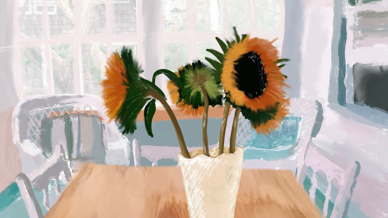
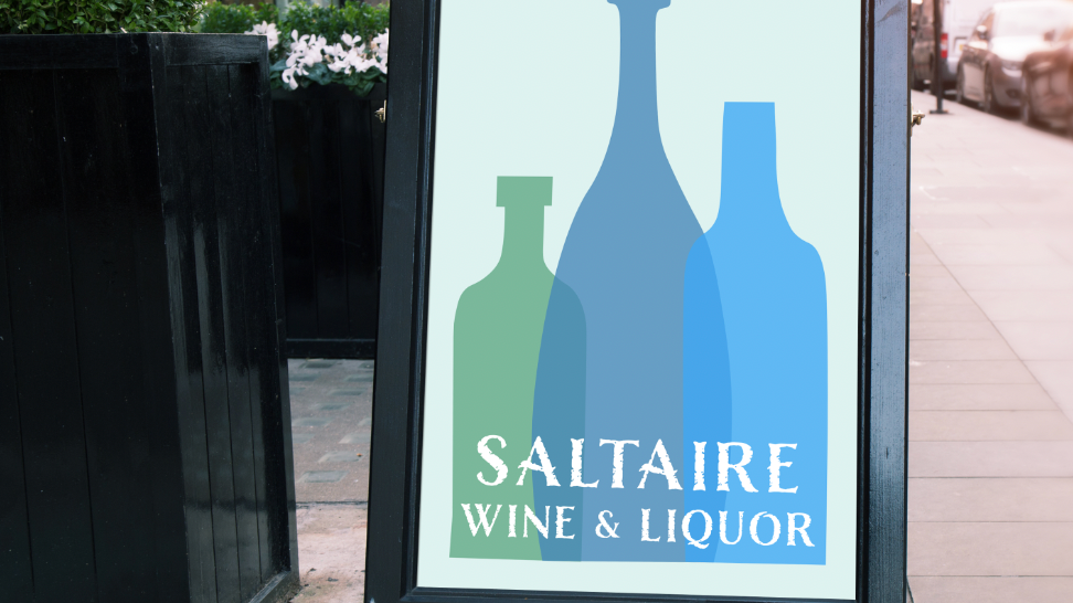
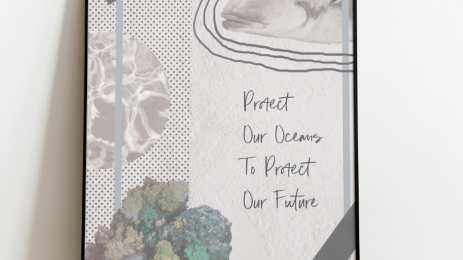
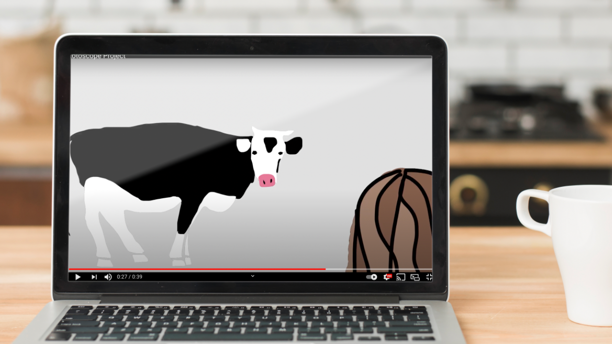
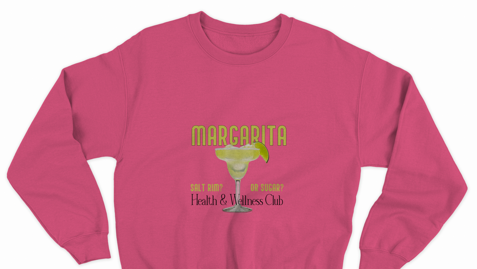
Content | As for my content, I gathered photos from both my own camera roll and websites such as Pinterest and Unsplash. I wanted to keep a similar color scheme by sticking with the traditional Santorini blues and whites, while bringing in some warmer tones as well.
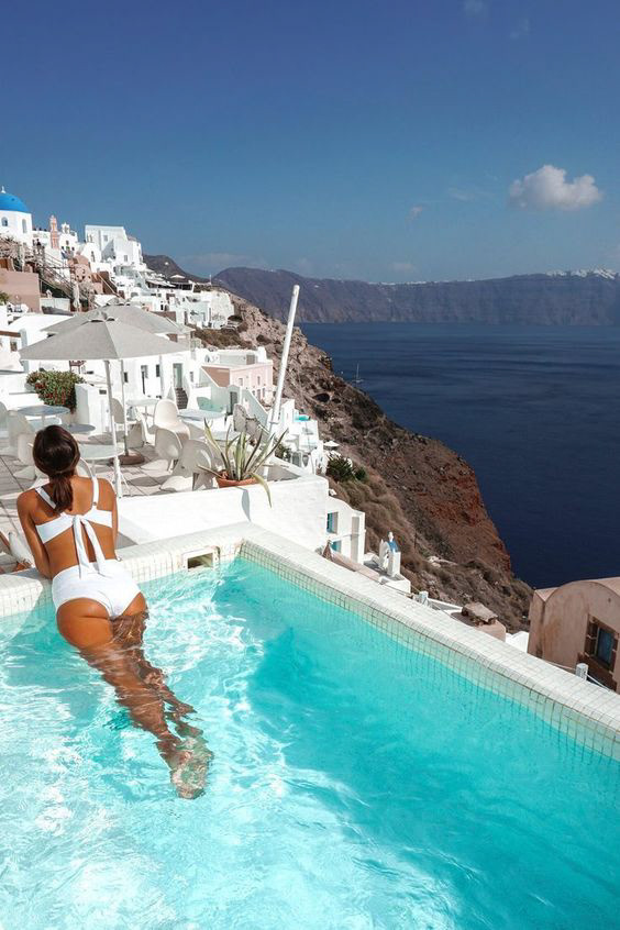
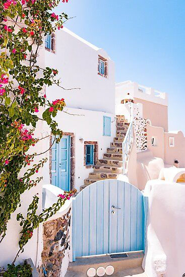
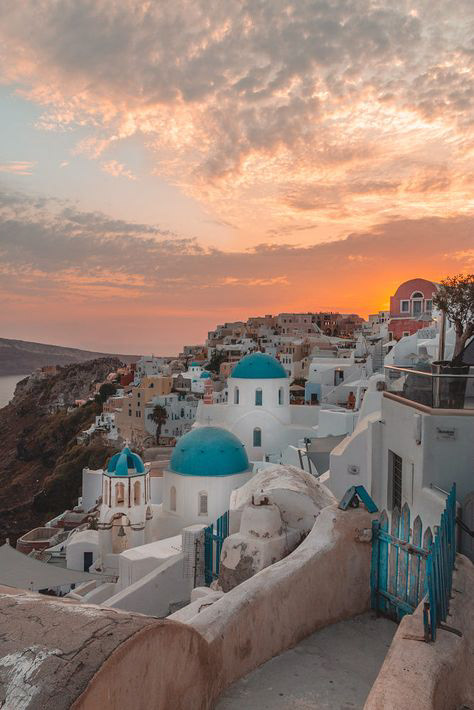
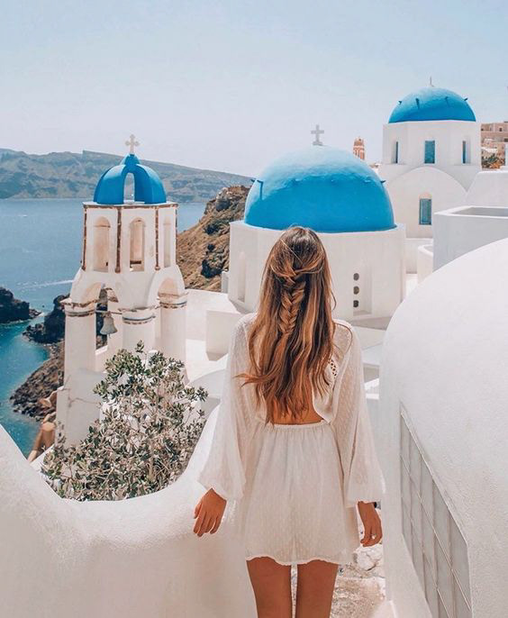
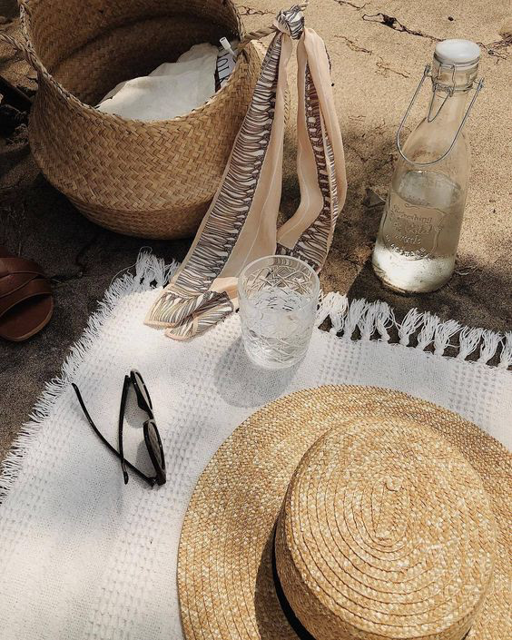
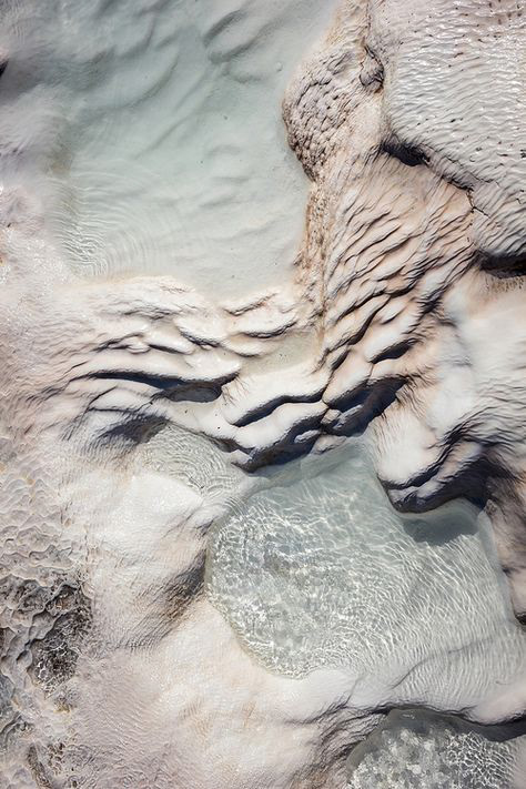
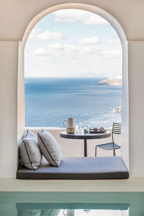
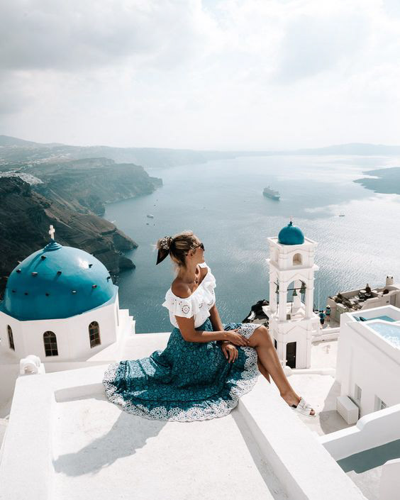
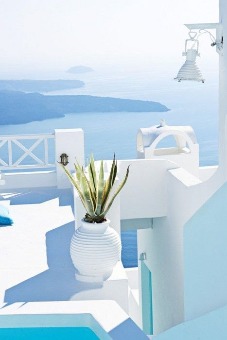
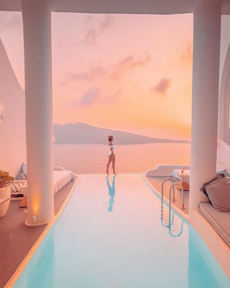
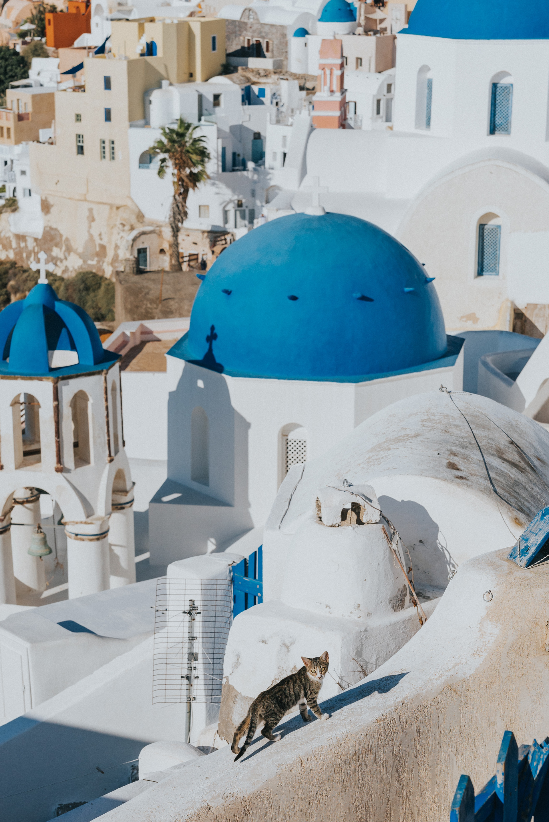
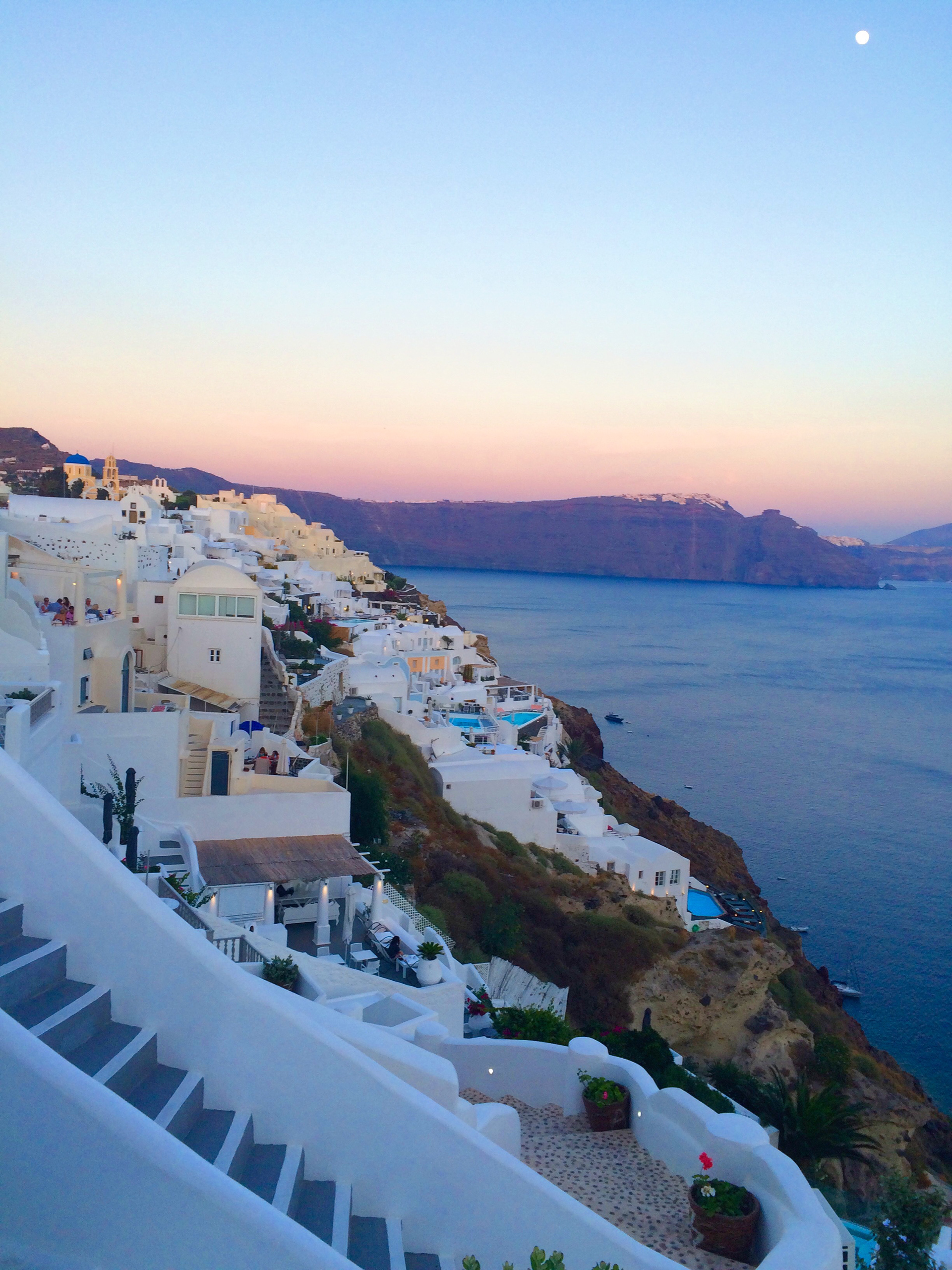
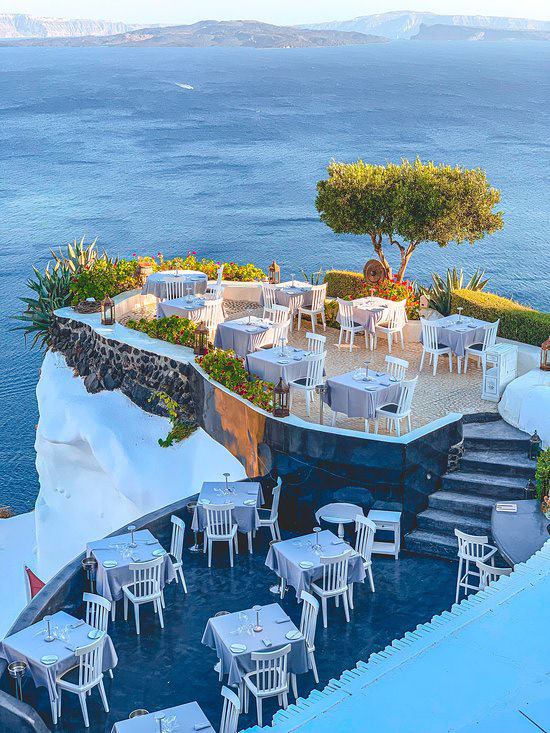
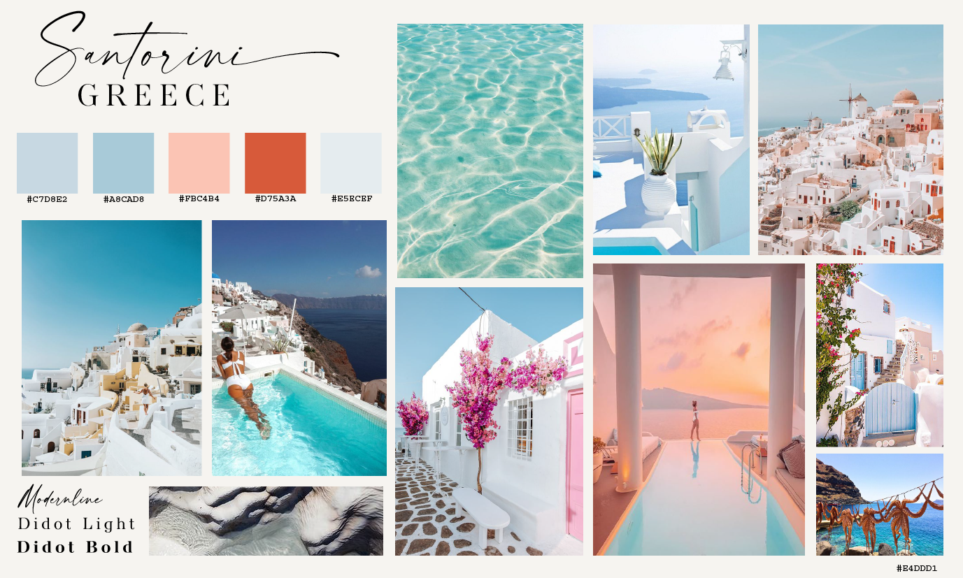
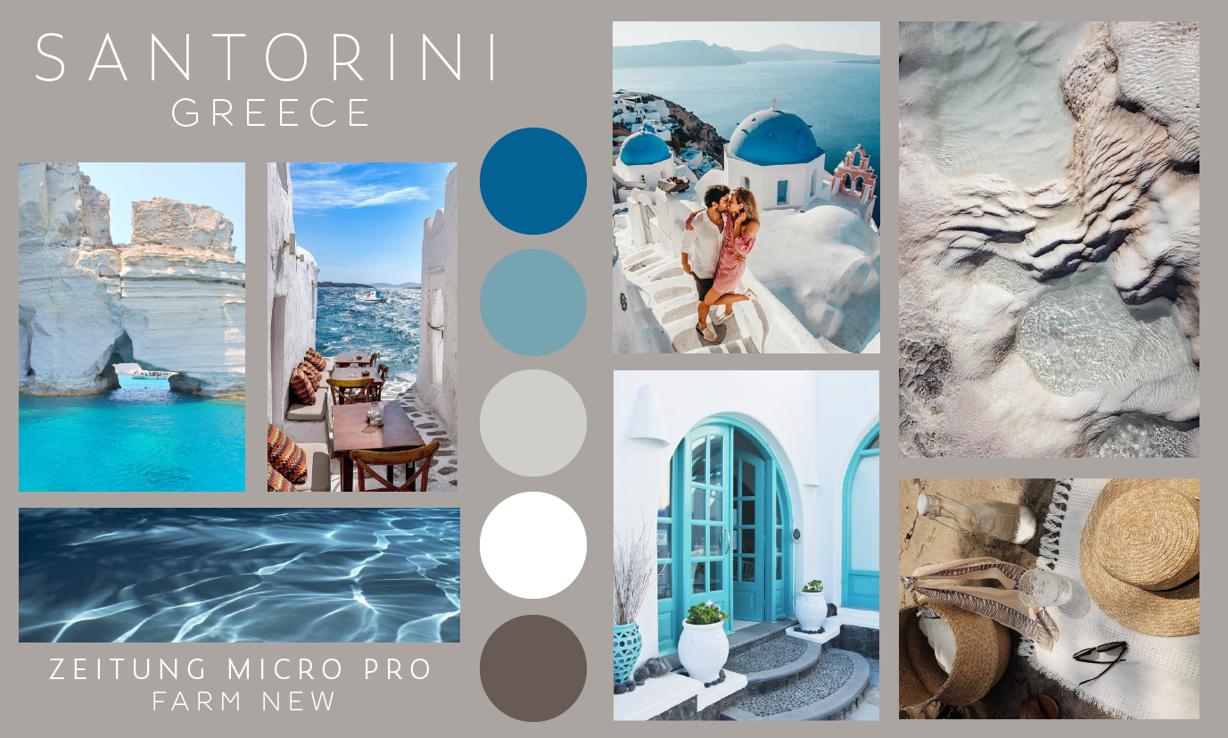
Mood Boards | I then created mood boards, gathering ideas of colors, fonts, and imagery that I may want to use in my website. I wanted to go for a luxurious, relaxed feel.
Site Map | The next step was designing a site map, which maps out the navigation, as well as each of the pages and categories included in the website.
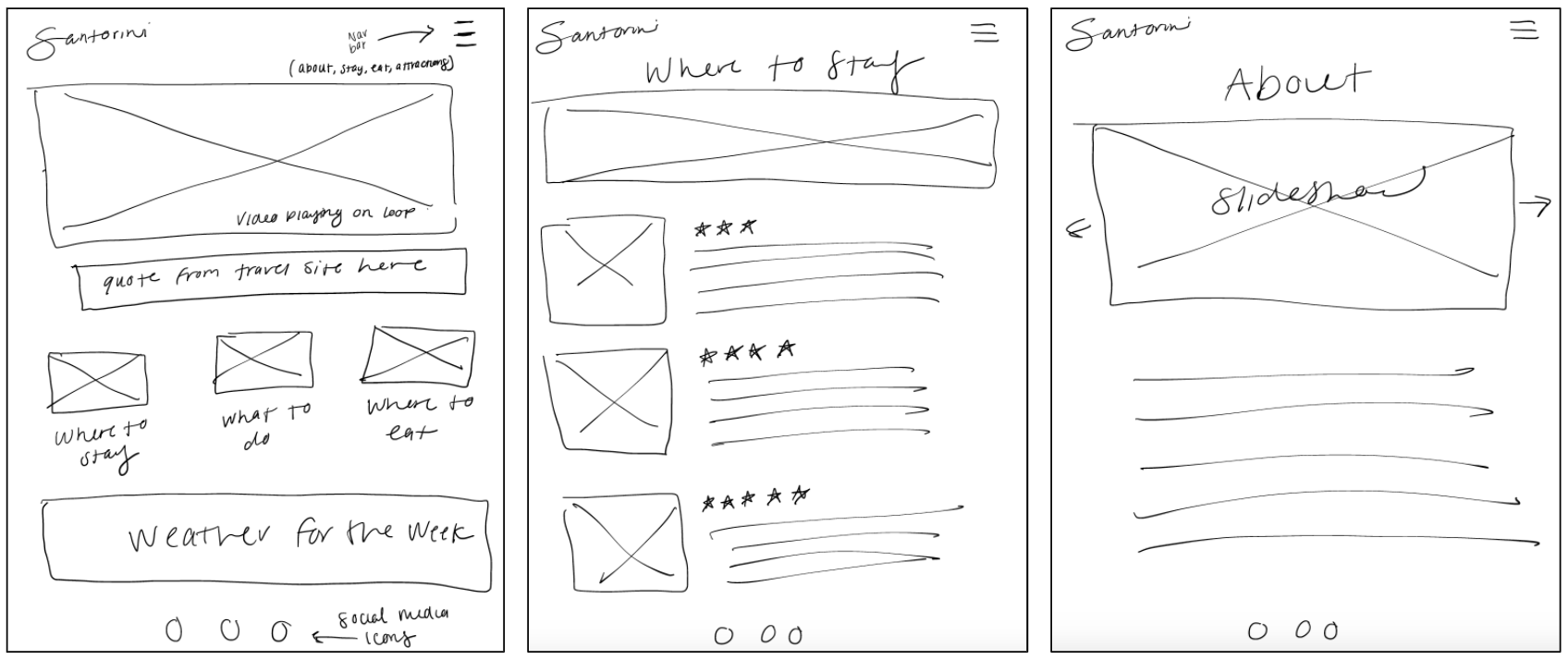
Wireframes | Using my site map, I sketched out rough wireframes for my website, getting an idea of how I wanted my layout to look for both digital and mobile formats. After sketching them out, I rendered the wireframes digitally to have a more clear idea.
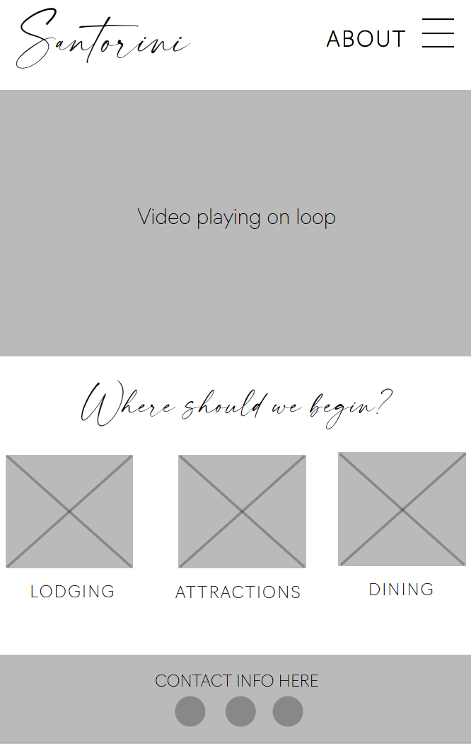
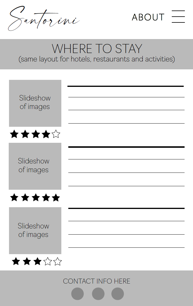
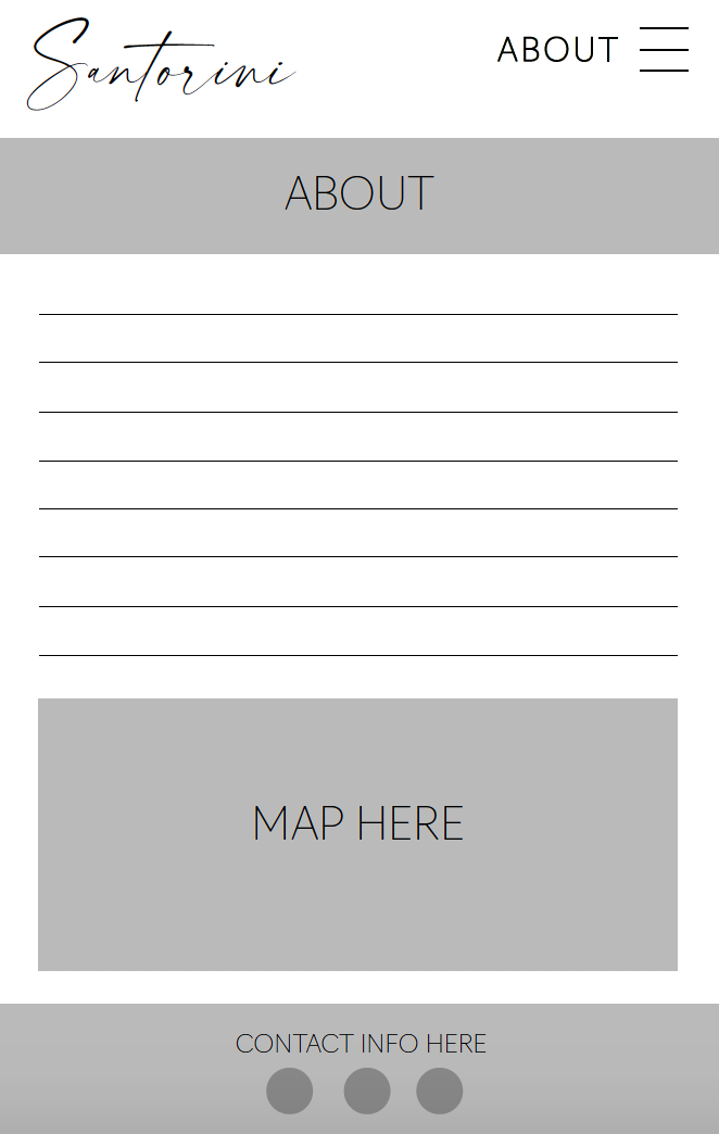
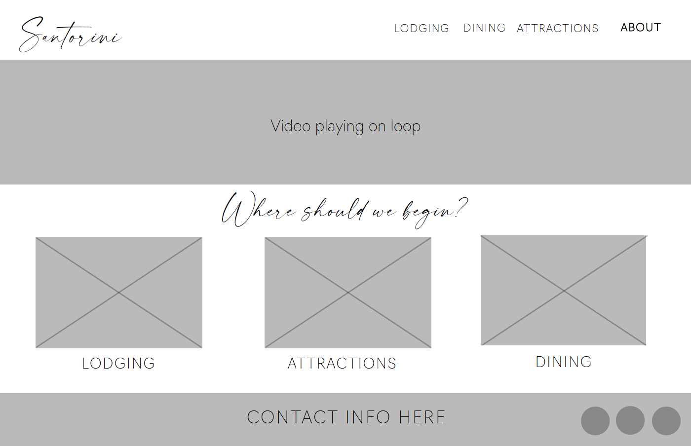
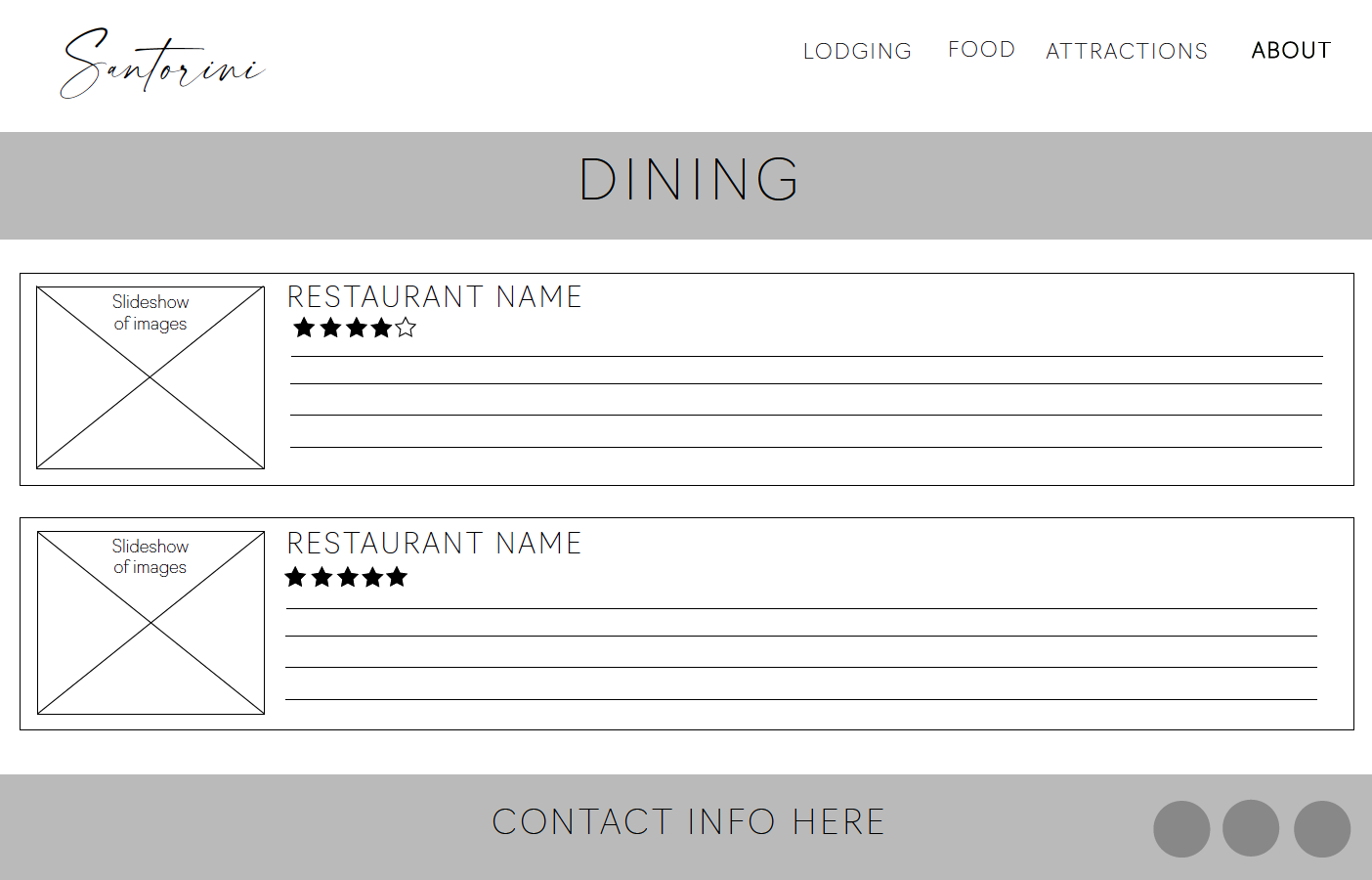
Mockups: Based off of my wireframes, I created a mockup version of my website for both digital and mobile formats. This is basically a more complex version of the wireframes; including text, images, and details.
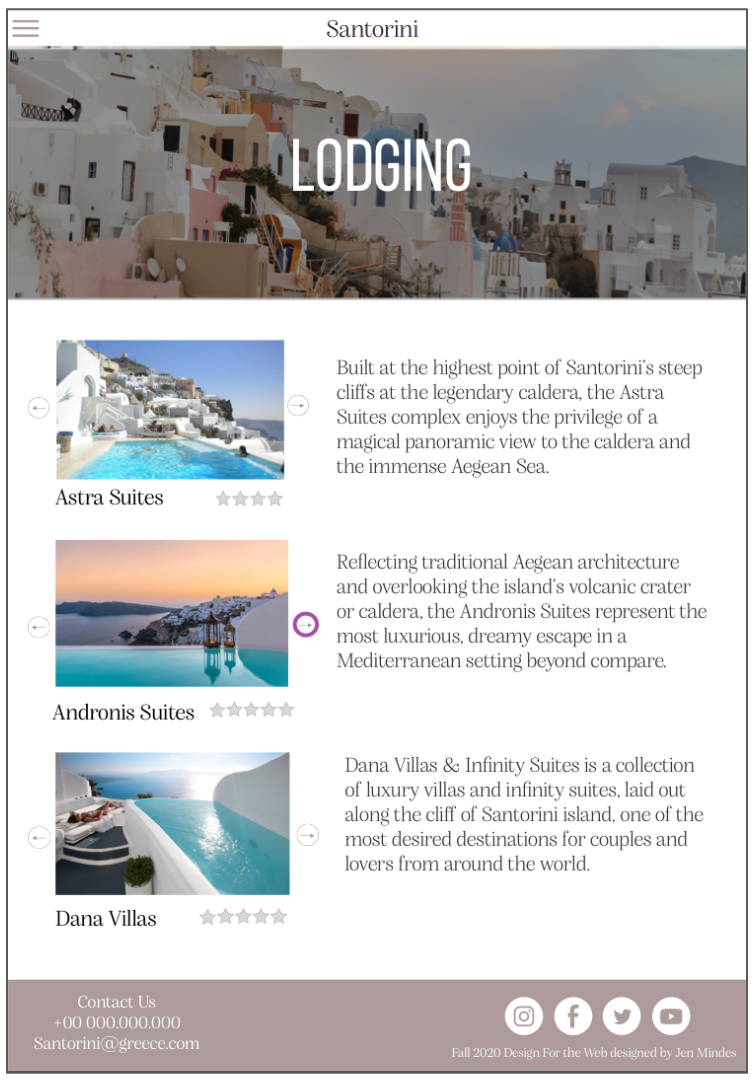
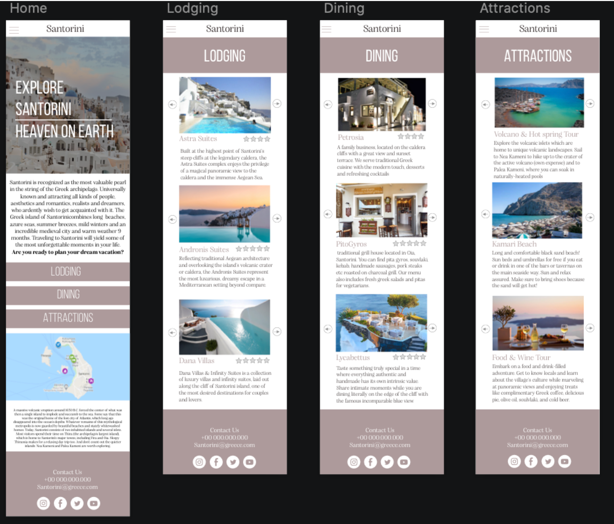
Mobile Prototype: Using my mockups, I designed a mobile prototype for my website. This gave me a better understanding of how I wanted my final website to function. This prototype is interactive and can be tested out.
Final Website
From here, I began to code my website based off of my prototype. Through much trial and error, I ended up with a result I was satisfied with. While the result does not look exactly like the prototype, I am happy with how it turned out, and I learned a lot along the way. You can view the final website by clicking the link below.

